Example: Climate Projections with Timeseries Data
Graphing the long term normalised temperature in the baseline against projections for future years is a good way to visualise how the average temperature will change over time.
- Select a site.
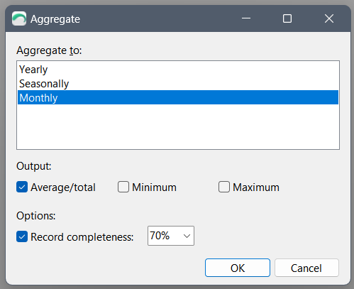
- For Daily, Hourly and Ten Minute data, click the Aggregate button on the toolbar and aggregate the data to Monthly.
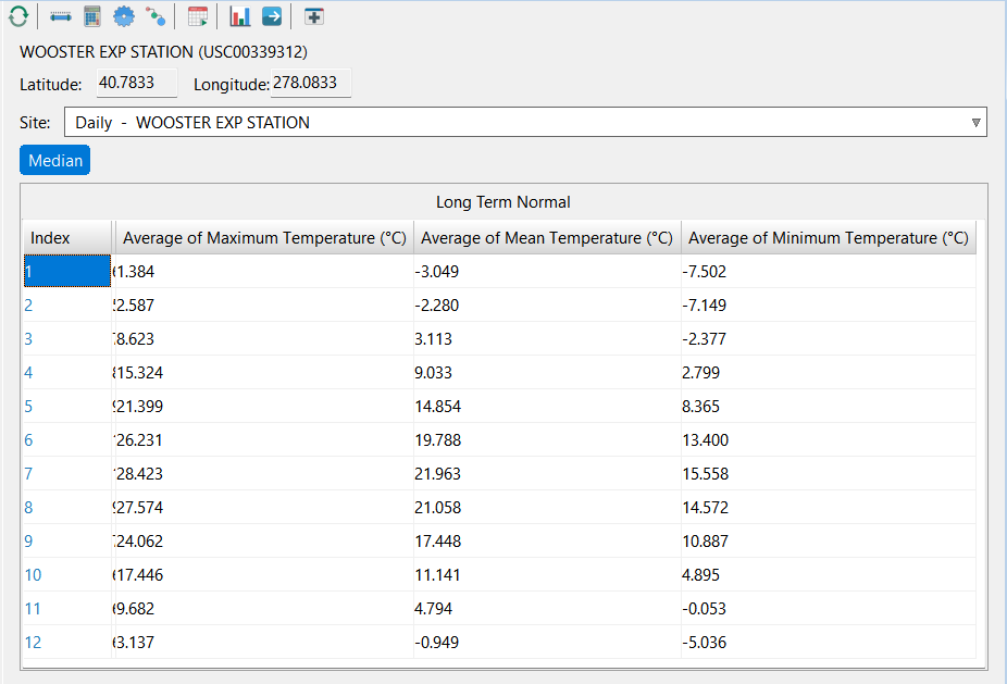
- Click the Long Term Normal button on the toolbar.
- Export or copy the data to another program (e.g. Excel).
- Click the Refresh button to reload the initial dataset.
- Click the Scenario button on the toolbar and specify a future scenario.
- Export or copy the data to another program (e.g. Excel)
- Repeat steps 5-7 for each desired future scenario (e.g. you may want to perform this for the years 2010, 2050, 2070 and 2100).
- Sort and format the results as required to make comparisons.
Results
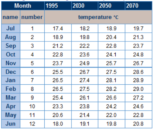
The below example chart shows how not only the hottest month is getting hotter, but also how the current average maximum extends to months earlier and later in the year.
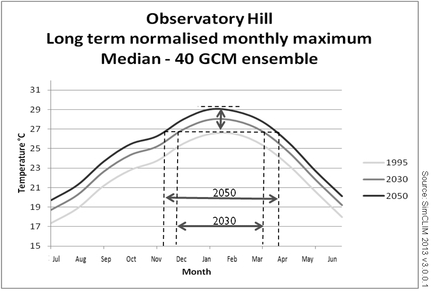
This graph is created by creating a different set of normalised monthly mean data. The baseline and one for every future year of interest.